REVIEW: Refined Randomness: Ellsworth Kelly’s “Spectrum Colors Arranged by Chance” at the Art Institute of Chicago
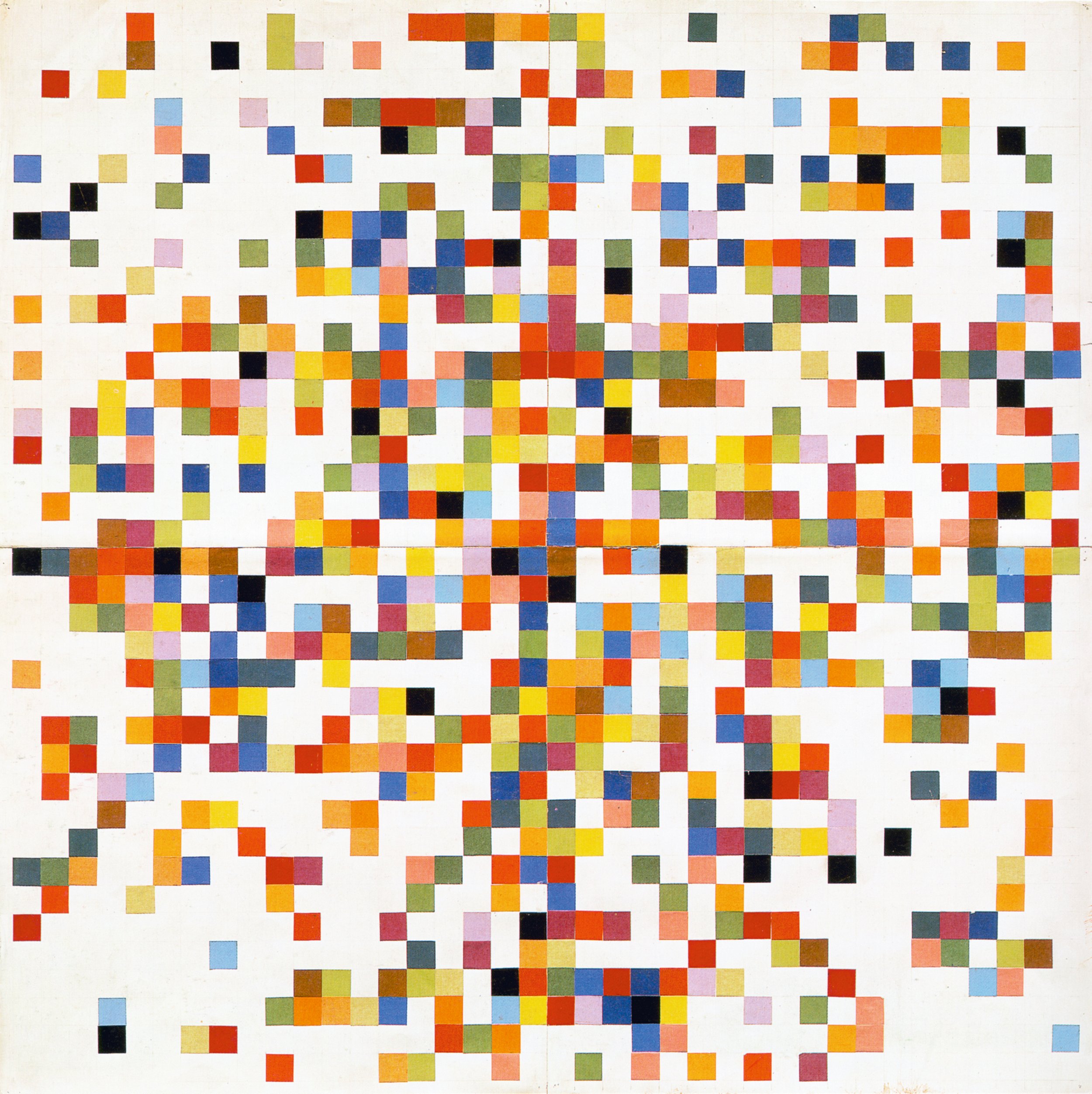
Ellsworth Kelly, Spectrum Colors Arranged by Chance II, 1951. The Museum of Modern Art, New York. Purchased with funds provided by Jo Carole and Ronald S. Lauder. ©️ Ellsworth Kelly Foundation.
REVIEW
Ellsworth Kelly: Spectrum Colors Arranged by Chance
The Art Institute of Chicago
111 S Michigan Ave.
Chicago, IL 60603
June 22–Sept 9, 2024
By David Sundry
The current exhibition at the Art Institute of Chicago titled “Ellsworth Kelly: Spectrum Colors Arranged by Chance” brings together for the first time the complete series of collages that Kelly produced in Paris between 1951 and 1953. The series consists of nine works on paper and one painting made in September of 1953 to bring the investigation to completion. The format of the works consists of one initial longish rectangle and then eight squares “arranged by chance in a 40-inch-wide grid formation” (quoted from the exhibitions literature). Again, as stated in the exhibition notes, these works were produced during a crucial phase of development in the artist’s career.
At the time, Kelly was continuing to move away from his traditional atelier type education of drawing from the figure in the morning and painting from the figure in the afternoon and these collages deepened his commitment to chance-based techniques and non-compositional strategies. Kelly was also attracted to papier gomette, a commercially produced “gum-backed colored paper commonly used by French schoolchildren” in 20 available colors in order to free himself from expected color combinations. He was also attracted by the humble nature of the material to undercut the work as a precious art object.
Ellsworth Kelly, Spectrum Colors Arranged by Chance IV, 1951. Margaret Fisher Endowment. ©️ Ellsworth Kelly Foundation.
Kelly’s use of chance-based technique is something he acquired from the Surrealists. They employed “objective chance” to bypass artistic skill and to unlock an unconscious state of mind, or expression, beyond conventional modes. The Surrealists also made use of automatic drawing, frottage, collage and the parlor game exquisite corpse to achieve the same end, the release from conventional forms of art making. But Kelly’s use of chance does not share the assumptions of the Surrealists. His work is not a window into an alternate mind state. Kelly is looking to build an image with a kind of object quality, a spare, refined impersonal aesthetic devoid of personal decisions. His aim is to employ chance in order to use color without inflection or personality, to remove the artist’s handwriting from the object. In short, to avoid private interpretation and to move the work forward into a common space or environment. His work is about looking and sophisticated perceptual plays, not theory. And something very interesting happens when you look closely at the collages.
Again, according to the Art Institute’s exhibition notes, Kelly determined the color through chance procedures and a seemingly neutral 40 x 40 grid of colored one-inch squares. However, upon closer inspection, the grid is not uniform but varies in a subtle and not readily decipherable manner. For instance, the first in the series (I) is a longish 40 x 20 rectangle. Kelly pursued this format once before settling on the square grid. Following Grid (I) Grid (II) is 38 x 38 and Grids (III) (IV) and (V) are 40 x 40 as advertised. Grid (VI) is 38 x 38 with a slightly larger unit square. Grid (VII) is 40 x 40 but Grid (VIII) is 28 x 28 with a much larger unit square, while Grid (IX) is 28 x 28 with a larger unit square and the introduction of an architectural black alternating crisscrossing grid. Finally, the painting is 33 x 33 with larger unit squares.
Ellsworth Kelly, Spectrum Colors Arranged by Chance VII, 1951. Glenstone Museum, Potomac, Maryland. ©️ Ellsworth Kelly Foundation.
As one spends time looking at and digesting the pieces, the initial reaction is most likely to the color and then subsequently to an awareness of Kelly’s introduction of white and then black, and how these two values further complicate the color scheme. After the vibrant immediacy of the color, the eye shifts to the secondary emergence of subtle intentional differences in size and scale. The changes in the pictorial construction lend different weight and density to the works in the series. Further, the suppression of some aesthetic decisions does not lend an air of randomness but, again, moves the focus to other inherent properties of the works: geometry, frontality, profile, placement, rhythm, the edge, the wall, and (especially in his later years) the constructed form. And these are all aesthetic areas involving deliberate decisions. Though the role of chance is emphasized in this series (and much of Kelly’s work throughout his career), in the end, this impersonal approach does not hide the economy and compression, the refinement and control that Kelly employs to make these pieces successful. And once this silent infrastructure has been identified, the number of additional intentional decisions behind the work quickly multiply: the tension between the serial exercise and the stand alone work, central clusters versus edge conditions, the private decisions determining the format structure prior to adopting the chance procedures.
I am not sure if Kelly meant these differences to be noticed by the viewer (i.e. the subtle changes in grid format or size of unit squares, etc.) and Kelly is too good of an artist not to have made these differences front and center if they were crucial to his sense of the overall perception and reading of the work. Unfortunately, the Art Institute in its exhibition literature omits any discussion of these differences and places undue emphasis on Kelly’s use of chance which in some sense is only a small aspect of his practice. And this omission of the works’ other qualities distort the underlying reasons for the both the works’ and the artist’s overall success. Seventy years later Kelly is owed a fuller discussion of this historic series than what was novel about them mid-last century. And it should also be pointed out that although Kelly moved away from his atelier type art education he continued to actively draw from nature and the figure for his entire career. This continued practice of observed reality is what creates the refined eye that is responsible for his work’s impact.
Ellsworth Kelly, Spectrum Colors Arranged by Chance IV, 1951. Margaret Fisher Endowment. ©️ Ellsworth Kelly Foundation.
Finally, there is the color again, the first impression and ultimately the last impression– the vivid and intelligent use of color and the understanding that this is an artist that has fully digested Matisse and Mondrian, two 20th century masters of color. And though he often determined his colors through chance, I am not sure if these random procedures really matter except as a means for the artist to open up to a kind of complexity that may not have been immediately at hand or, perhaps, to struggle free from cultural habits from certain historical moments. But, after establishing a type of color combination through random selection, that combination is validated as the “new” standard palette. And more than half a century later, the viewer could encounter a stand alone work in this series without wall labels or background information and regard each work as spare and beautiful, the result of a rarified artistic sensibility.
David Sundry is an artist, Architecture Editor of Bridge, and co-founder of SITE/less Chicago.
Like what you’re reading? Consider donating a few dollars to our writer’s fund and help us keep publishing every Monday.


